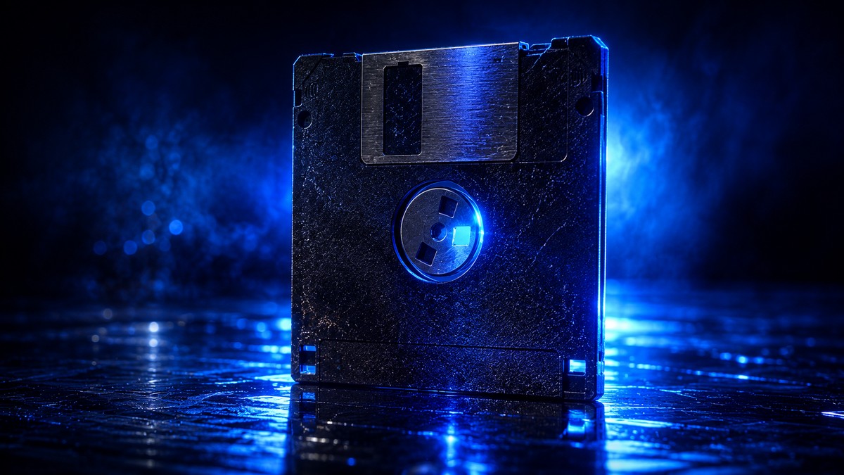
Look at the save icon in almost any app you use. It is a little floppy disk. Not a cloud, not a checkmark, not some sleek modern glyph. A floppy disk. A piece of storage technology that basically died out about twenty years ago and that most people under twenty five have never actually held in their hands.
And yet you tap that little square every single day to save your work, without a second thought. There is something quietly funny about that. We are all using a picture of a machine most of us have never seen in real life, and it works perfectly. Nobody gets confused. That is the strange power of a symbol that stuck.
A whole disk held less than one photo
Here is the part that puts the floppy disk in perspective. The whole thing could hold about one and a half megabytes of data. That is less than a single photo from the phone in your pocket right now. One picture. The kind you snap and forget about a hundred times a day would not have even fit on one of these disks.
Back then, that little square was how you carried your work around. If you wanted to move a document from one computer to another, you saved it onto the disk, popped it out, walked it across the room, and slid it into the next machine. It was physical. It was slow. And it was the everyday reality of getting anything done on a computer for years.
So when you think about how much a floppy disk could actually store, it is almost hard to believe we built our whole idea of saving around it. But we did. And the icon outlived the object by decades.
Why the icon never got replaced
Here is the honest reason the floppy disk survived as the save symbol. It survived because everyone already recognized it, and no one has come up with a better picture for the idea of saving. That is really it. It is not that designers love floppy disks. It is that the alternatives are worse.
Think about it. What image actually means save to a person? A cloud can mean upload, or sync, or backup. A checkmark means done, or confirmed, or approved. An arrow could mean almost anything. The floppy disk had one job in people’s minds, and it did that job cleanly. When you have a symbol that everyone reads the same way, you do not throw it out just because the hardware behind it is gone.
So we all keep tapping a piece of nineteen eighties hardware, most of us having never seen one in real life. The disk is dead. The picture of the disk is immortal. That gap between the two is one of the neatest little accidents in how we design software.
What this says about good design
There is a real lesson tucked inside this floppy disk story, and it is one worth remembering any time you build something people have to use. Familiarity is worth more than accuracy. The save icon is technically wrong. It points to a device that no longer exists. But it is instantly understood, and that is what actually matters when someone is trying to get work done.
Good tools meet people where they already are. They lean on the shapes and habits a person already carries in their head, instead of forcing everyone to learn a brand new language just to hit save. The floppy disk works because it asks nothing of you. You already know what it means.
That is the kind of thing we think about when we build. At Built by Buit we make practical apps and AI tools, and a lot of the work is in these small, easy-to-miss decisions. When we take on custom app development, we are always asking whether a screen feels obvious to the person tapping it, not just correct on paper. Sometimes the smartest move is to keep the floppy disk. And sometimes it is a good excuse to notice how much of the tech around you is quietly still living in the eighties.
Prefer to watch?
Built by Buit builds practical apps and AI tools for businesses across South Florida. See what we make, or start a project.
Leave a Reply